Jeng
A different
state of mind.
The larger idea
A drink can change the state of a moment.
The opportunity
Alcohol-free drinks are often defined by what they leave out. Jeng needed to feel like its own kind of social ritual.
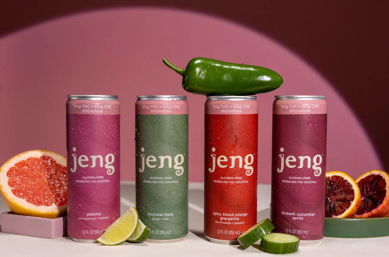
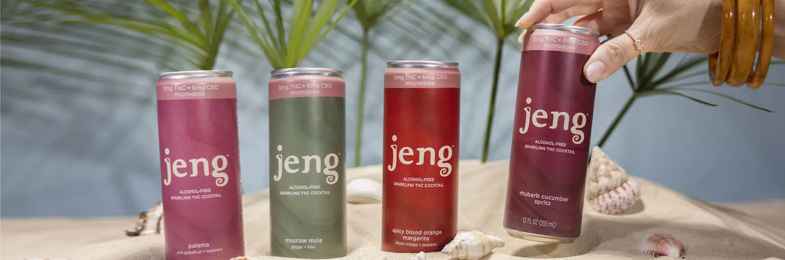
The key decision was to build around what Jeng adds to a moment: color, sensation, and a shift in perspective. One package architecture holds the range together; flavor colors and can-top bands help people distinguish the varieties and product lines.
01
Design the state, not the substitute.
Jeng is more than an alternative to alcohol. It gives people a new way to mark a transition—from work to rest, ordinary to unexpected, alone to together.
02
Make the familiar feel different.
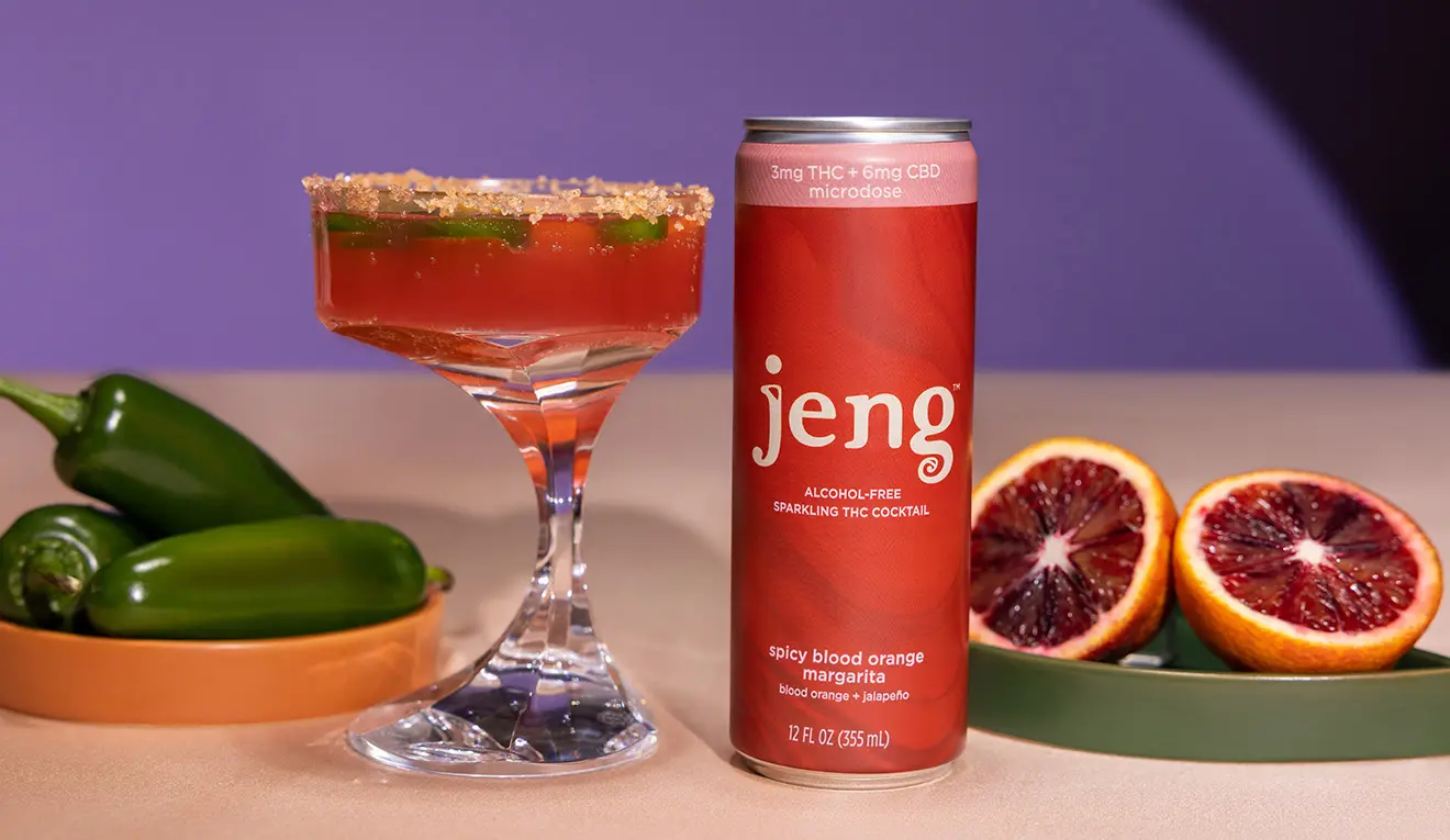
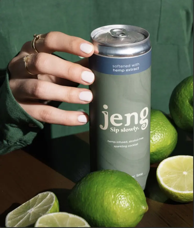
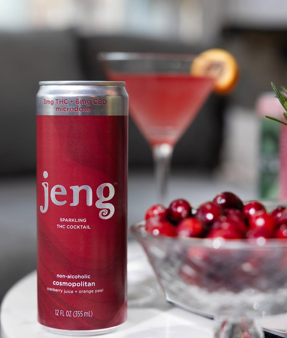
Saturated color, tactile ingredients, and slightly surreal arrangements turn a simple can into an invitation. The world feels social, sensory, and a little unexpected.
- 01
Color sets the state.
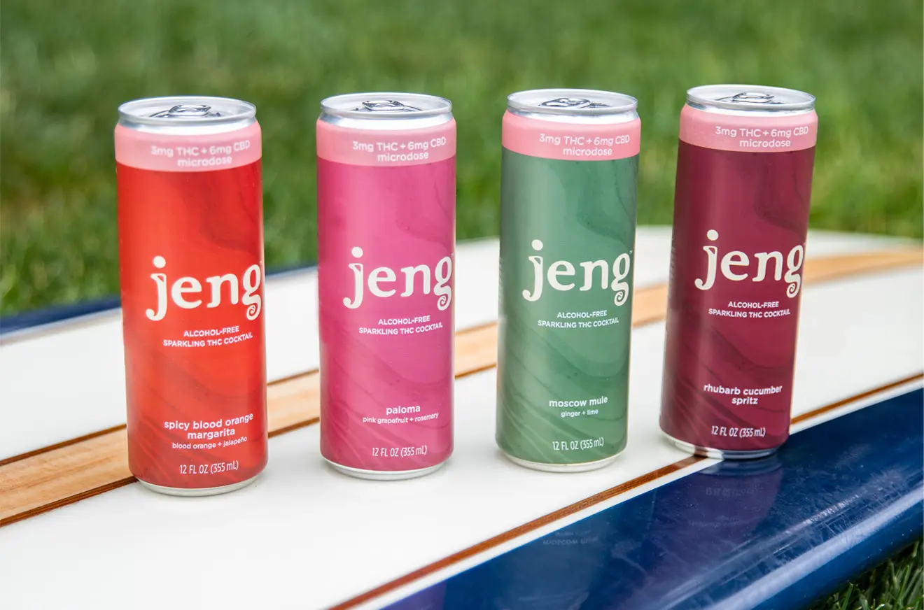
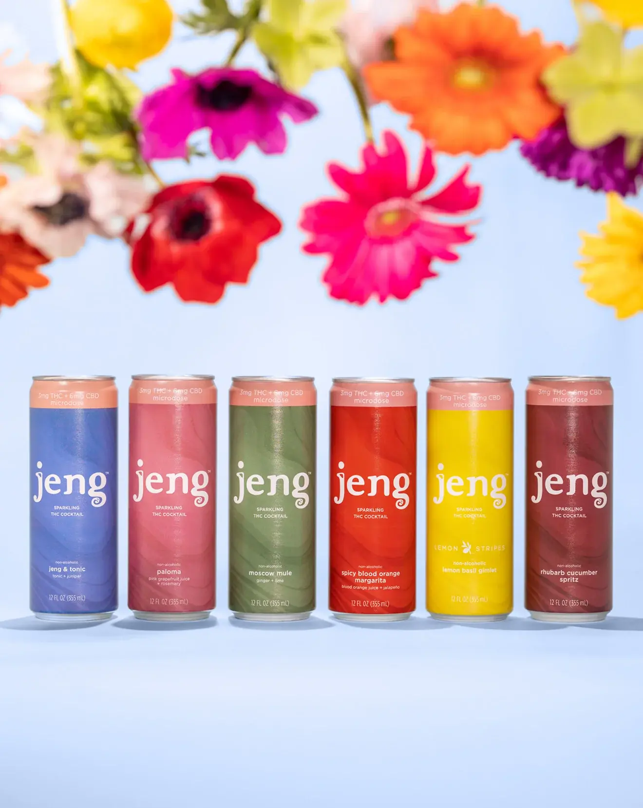
Every variety owns a distinct field while staying inside one recognizable palette.
- 02
Ingredients become signals.
Citrus, herbs, peppers, and botanicals make each flavor feel immediate and specific.
- 03
One structure holds it together.
A consistent wordmark and package architecture let the range keep growing.
03
One system. Three product lines.
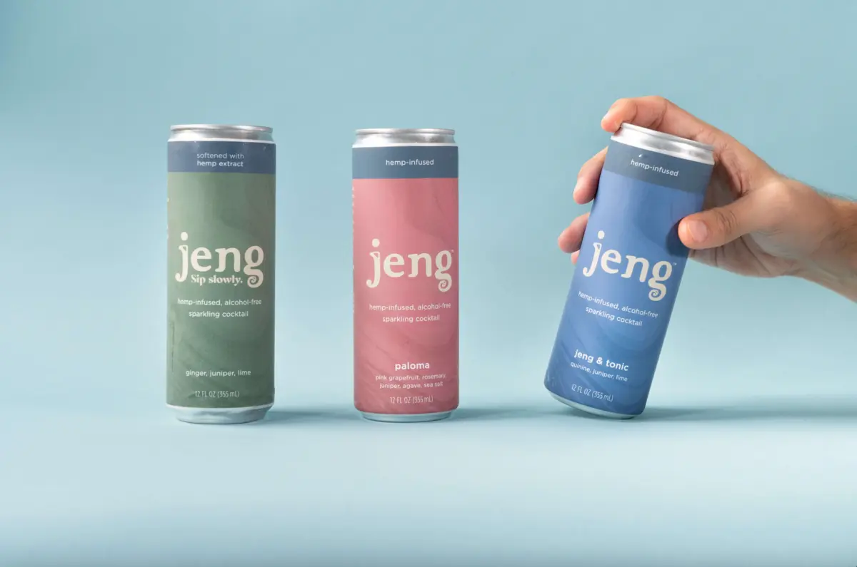
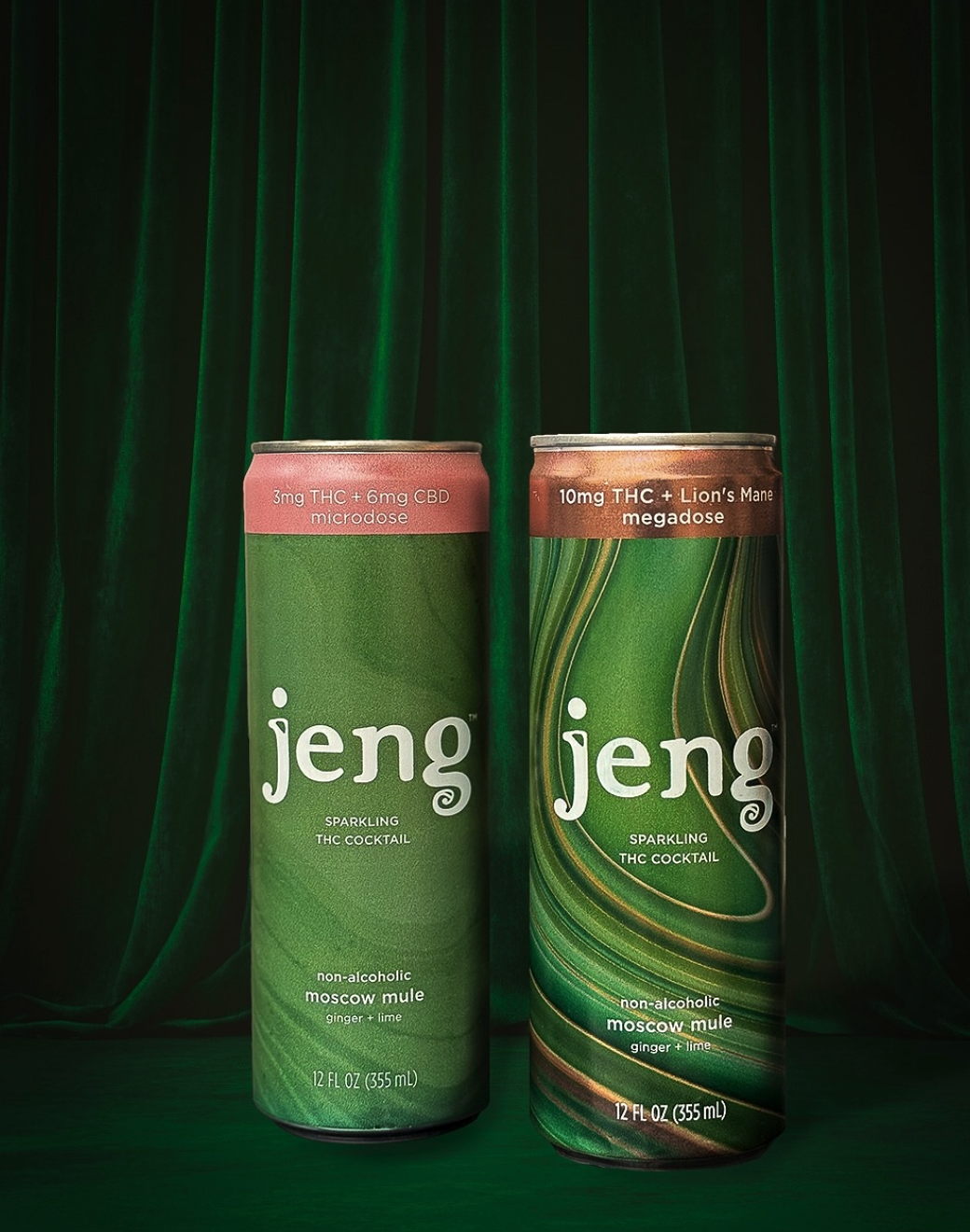
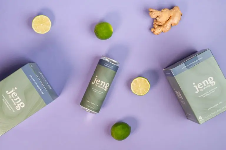
The identity grew across CBD, THC + CBD, and functional mushroom lines. Can-top bands and label treatments distinguish the formulas. The wordmark, typography, and tonal palette keep the full portfolio connected.
04
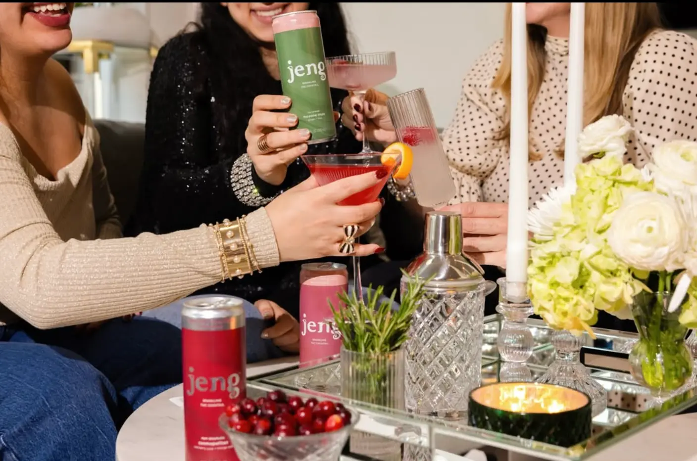
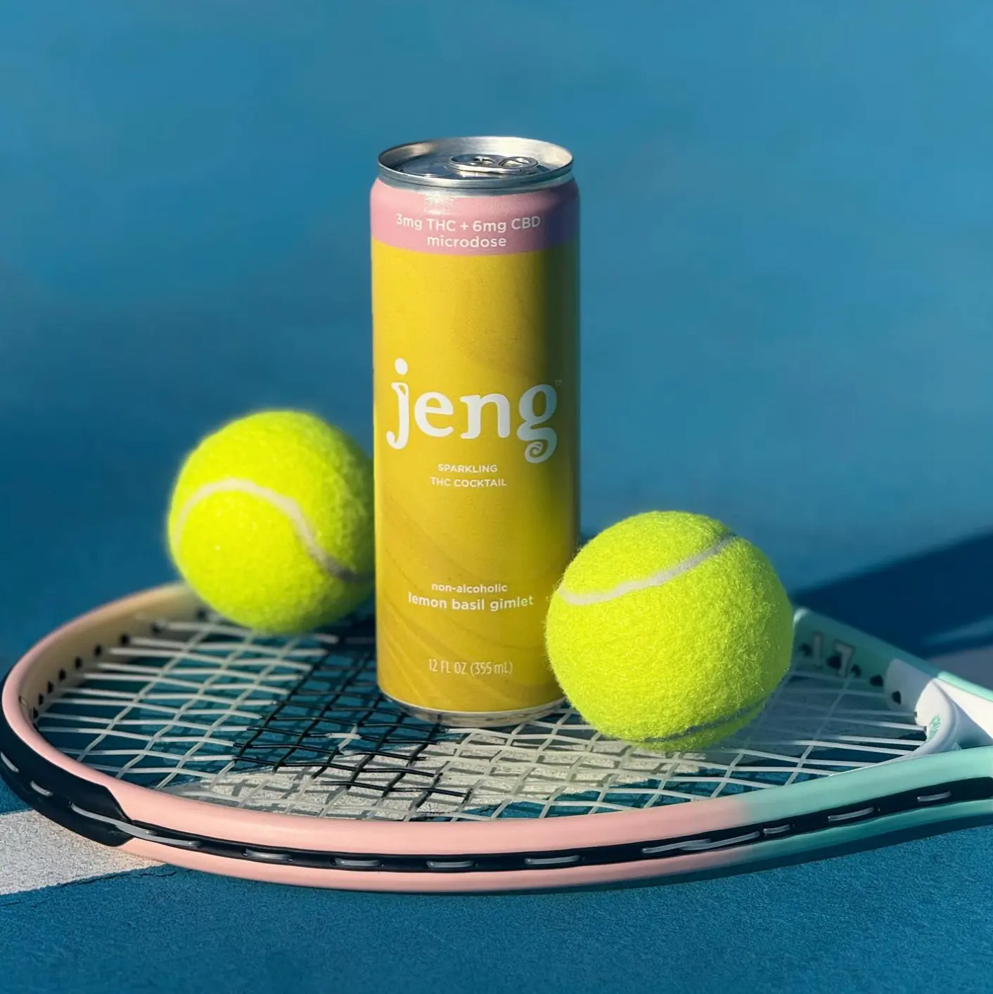
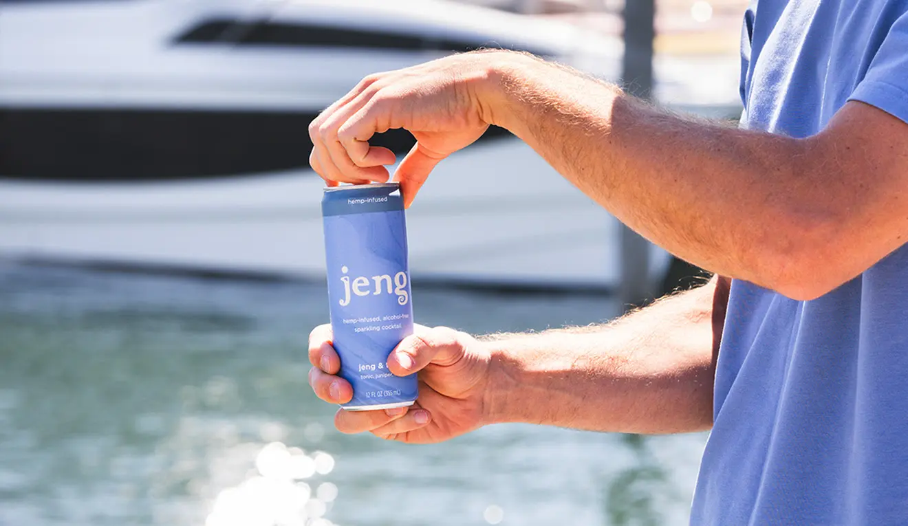
The system moves from shelf to table.
The result
One idea, built to multiply.
Jeng grew from a regional startup into a nationally distributed brand across three product lines. A shared wordmark and package structure connected the three lines, while color and ingredient imagery gave each flavor its own expression.
Creative direction and design by Robert Persky for Jeng.
Grab and move. Or focus the ball and use arrow keys. Home returns it to the starting point.